Python Figures for Non-technical Presentations
I was recently selected as a finalist for a research prize at the University of Bath. As part of this, I was invited to give a ten minute presentation on my research to a panel of judges. Giving a concise presentation in ten minutes is already quite challenging, even when presenting to a fairly well-informed conference. The real challenge here, however, was that the panel was made up largely of non-technical academics. This really forced me to consider carefully how best to describe my work, particularly its context and impact. One thing I couldn’t quite escape, though, was the need to present data in a graphical way, i.e. in a scientific figure.
Now, making impactful figures is something I quite enjoy doing. This time, however, my usual strategy would not be appropriate as my usual kind of figure would be simply too technical to understand in the short amount of time it would be displayed. Instead, I tried a different approach. I recently came across a blog post (here) which contained some very useful advice. Without reiterating the whole of the original post, the crux of the argument is that the key to a good figure/graphic/plot is to increase the data-to-ink ratio, i.e. figures often have too much extra flair that actively inhibits our ability to quickly interpret the meaning. Practically, this means we should consciously try to remove all redundant elements in order to emphasise the important components. Good examples of this kind of data presentation can be found in news journals, where some quantitative information or trend needs to be communicated to the, likely non-technical, readership.
To illustrate this, lets create some example data and present it in a more technical format.
Version 1
import numpy as np
import matplotlib.pyplot as plt

plt.style.use("seaborn-v0_8")

rng = np.random.default_rng(314159)

N = 50

t = np.linspace(0, 60, N)

m1 = 2
c1 = 0
e1 = 10

y1 = m1*t + c1 + e1*rng.random(N)

m2 = 1
c2 = 0
e2 = 5

y2 = m2*t + c2 + e2*rng.random(N)

fig, ax = plt.subplots(1, 1, figsize=(5,4), dpi=200)

ax.plot(t, y1, '--o', label='1', ms=6)
ax.plot(t, y2, '--s', label='2', ms=6)

ax.set_xlabel(r'$t$ (s)')
ax.set_ylabel(r'$y$ (m)')

ax.legend(title="Sample", frameon=True, facecolor='w', fontsize=12, title_fontsize=12)

plt.tight_layout()

plt.savefig("./output/figure_v1.png", dpi=120, facecolor='w', bbox_inches='tight')

plt.show()

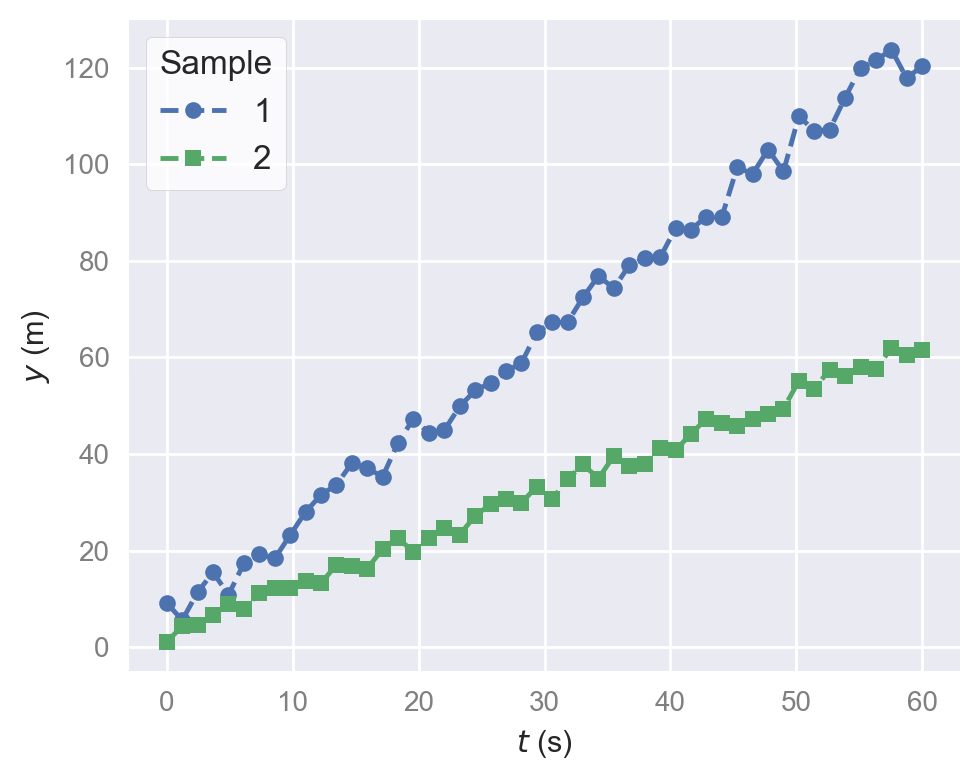
I have used one of the styles, seaborn-v0_8, that is included with matplotlib. This does quite a lot of the styling and formatting for you. Here we have two data series, one showing a faster increase of displacement, \(y\), with time, \(t\). This is a perfectly adequate graph and conveys the information well, particularly for a specialist audience. However, we can improve this significantly to make it more accessible to a general audience.
Version 2
import numpy as np
import matplotlib.pyplot as plt

plt.style.use(['default'])

main_color = "grey"

plt.rcParams["axes.spines.top"] = False
plt.rcParams["axes.spines.right"] = False
plt.rcParams["font.family"] = "sans-serif"
plt.rcParams["font.sans-serif"] = ["Arial"]
plt.rcParams["axes.labelsize"] = 14
plt.rcParams["axes.labelcolor"] = main_color
plt.rcParams["axes.edgecolor"] = main_color
plt.rcParams["xtick.labelsize"] = 14
plt.rcParams["ytick.labelsize"] = 14
plt.rcParams["xtick.labelcolor"] = main_color
plt.rcParams["ytick.labelcolor"] = main_color
plt.rcParams["xtick.direction"] = "out"
plt.rcParams["ytick.direction"] = "out"
plt.rcParams["xtick.color"] = main_color
plt.rcParams["ytick.color"] = main_color

rng = np.random.default_rng(314159)

N = 50

t = np.linspace(0, 60, N)

m1 = 2
c1 = 0
e1 = 10

y1 = m1*t + c1 + e1*rng.random(N)

m2 = 1
c2 = 0
e2 = 5

y2 = m2*t + c2 + e2*rng.random(N)

fig, ax = plt.subplots(1, 1, figsize=(5,4), dpi=120)

ax.plot(t, y1, '--o', c='tab:red', ms=6, mew=2.5, mfc='w',
        alpha=1, clip_on=False)
ax.plot(t, y2, '--s', c='tab:blue', ms=6, mew=2.5, mfc='w',
        alpha=1, clip_on=False)

ax.set_xlabel(r'Time (seconds)')
ax.set_ylabel(r'Displacement (metres)',
              rotation=0,
              horizontalalignment='left',
              verticalalignment='top')
ax.yaxis.set_label_coords(0.02, 1.0)

ax.set_ylim(bottom=0)
ax.set_xlim(left=-1)

ax.set_yticks([0, 50, 100])
ax.set_xticks([0, 30, 60])

ax.text(50, 90, "Sample 1", color='tab:red', fontsize=16)
ax.text(40, 30, "Sample 2", color='tab:blue', fontsize=16)

plt.tight_layout()

plt.savefig("./output/figure_v2.png", dpi=200, facecolor='w', bbox_inches='tight')

plt.show()

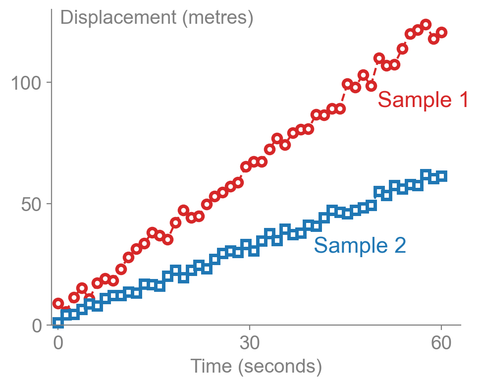
Beginning with the default matplotlib style, many changes can be made by updating parameters in rcParams:
- Removed the spines from the top and right of the figure
- Use of an easily-readable sans-serif font (Arial)
- Axis frame, labels and numbers shown in muted grey
Further changes are made to the figure axis object ax once instantiated:
- Spelling out variables / measured quantities and their units
- Change positioning and rotation of axes labels
- Reducing the number of tick labels
- Directly label each data series with corresponding colour
- Add a little visual interest by using partially filled symbols
The overall effect is much more immediate and impactful. It is very quickly apparent that sample 1 shows a faster increase in displacement than sample 2. The quantitative information is still present, but the qualitative comparison is now better emphasised.
Of course, these recommendations may not be wholly applicable depending on the nature of your data. However, the general principle still remains: remove redundant components to emphasise the important ones.
Version Information
-
python: 3.12.11 -
matplotlib: 3.10.3 -
numpy: 2.3.1
Enjoy Reading This Article?
Here are some more articles you might like to read next: