Python for Publication Quality Figures - Part 1
TL;DR
It is easy to produce publication-quality scientific figures using Python, Matplotlib and SciencePlots, with just a few additional tweaks of rcParams.
Overview
Python (3.x) is a popular and versatile programming language and over the years it has become my go-to tool for a wide variety of science-related problems. In particular, I like to use Jupyter notebooks as a way of documenting and iterating on data exploration and analysis, and so plotting data and producing figures is an inherent part of this process. There are numerous plotting packages for Python, e.g. Bokeh, Plotly and Altair. Each library has its merits and can all produce very attractive, publication-quality figures. I have dabbled with a number of these packages, but recently I have settled on perhaps the slightly more humble Matplotlib as a reliable way to produce very high-quality figures of the type you would find in a peer-reviewed publication or conference presentation.
Basic Plots
Most Python-using-scientists will have probably used Matplotlib at one time or another to plot out a curve or some experimental data, and would have been met with something like this:
import numpy as np
import matplotlib.pyplot as plt

plt.style.use("default")

rng = np.random.default_rng(314159)

N = 20

ran_nums = rng.random(N)

alpha = np.linspace(0,10,N)

m = 3
c = 3
e = 3

beta = m*alpha + c + e*ran_nums

fit = np.polynomial.polynomial.polyfit(alpha, beta, 1)

fig = plt.figure(figsize=(6,4))

plt.plot(alpha, beta, 'o', c='b')

plt.plot(alpha,
         np.polynomial.polynomial.polyval(alpha, fit),
         '-', c='r')

plt.xlabel('alpha (units a)')

plt.ylabel('beta (units b)')

plt.legend()

plt.savefig('./output/fig_v1.png', bbox_inches='tight', dpi=200)

plt.show()

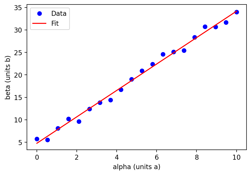
As a stand in for real data, I have generated some random numbers following a relationship between the two quantities \(\alpha\) and \(\beta\) such that \(\beta \propto \alpha\), with \(\alpha\) as our independent variable and \(\beta\) our dependent variable (blue circles). The data \(\beta(\alpha)\) are fitted with a straight line, shown in red.
The resulting figure is perfectly useful in conveying the information and would probably be sufficient for my own personal notes. However, I would be hesitant to share such a rudimentary figure with colleagues and certainly wouldn’t consider using it in a publication or presentation.
SciencePlots
The simplest and easiest way to improve on the default style of Matplotlib is the Python package SciencePlots :
import numpy as np
import matplotlib.pyplot as plt
import scienceplots

plt.style.use(['science'])

rng = np.random.default_rng(314159)

N = 20

ran_nums = rng.random(N)

alpha = np.linspace(0,10,N)

m = 3
c = 3
e = 3

beta = m*alpha + c + e*ran_nums

fit = np.polynomial.polynomial.polyfit(alpha, beta, 1)

fig, ax = plt.subplots(1, 1, figsize=(6,4))

ax.plot(alpha, beta, 'o', c='tab:blue', label='Data',
        ms=6, zorder=10, clip_on=False)

ax.plot(alpha,
         np.polynomial.polynomial.polyval(alpha, fit),
         '-', c='tab:red', label='Fit')

ax.set_xlabel(r'$\alpha$ (Units A)')

ax.set_ylabel(r'$\beta$ (Units B)')

ax.set_ylim(bottom=0)
ax.set_xlim(left=0)

plt.tight_layout()

plt.legend()

plt.savefig('./output/fig_v2.png', bbox_inches='tight', dpi=200)

plt.show()

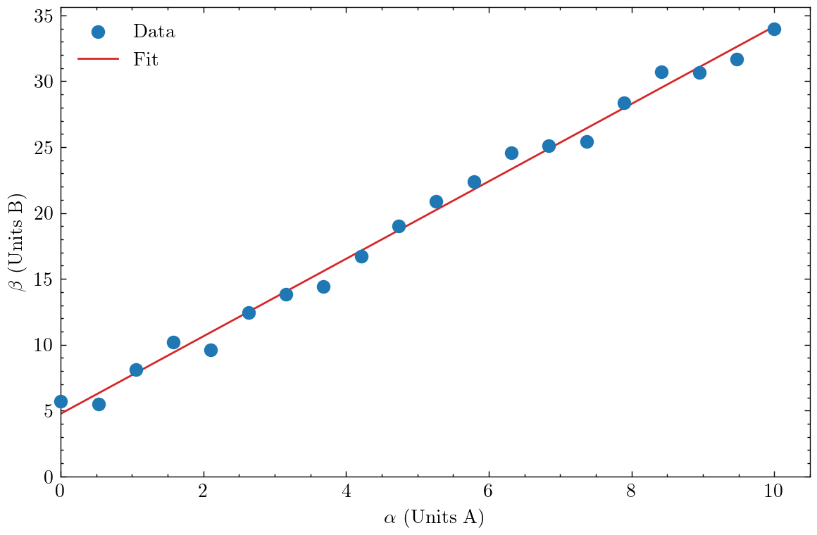
The main usage is to import the package using import scienceplots and to direct Matplotlib to use the default style with plt.style.use(["science"]) (you can include multiple styles here to combine features - see here). With this simple change, the figure already looks a lot more professional.
Some other minor changes are to override the default Matplotlib colours with colours from the Tableau palette. SciencePlots also includes a more aesthetically pleasing colour palette - just remove the colour specification (c=tab:x) from the ax.plot lines.
Additionally, I set the left and bottom limits of the two axes to be zero, as this helps provide a more intuitive understanding of what kind of trend $\beta(\alpha)$ follows. In doing so, the first data point now overlaps the y-axis line - setting zorder=10 (a high number) and clip_on=False ensures the point is plotted on top of the line and is not clipped by the frame either. An additional consequence is now the line of the linear fit is plotted below the data points. Personally I think I prefer it this way, but you could remedy this by setting the zorder of the line to be higher than the data points.
I also switched from the plt.plot syntax to the ax.plot syntax (using plt.subplots) - the latter is a lot more powerful and has broader functionality, though it is somewhat more verbose, e.g. ax.set_xlabel compared to plt.xlabel. Finally, I used $\LaTeX$-compatible dollar-math and slash-commands, e.g. $\alpha$, to produce Greek characters in the axes labels (you need to specify a raw string with the prefix r"" for this to work).
The combined result is a much more refined and well-considered presentation of the data. The figure is also pleasing to look at, which is no bad thing! The major downside that you might experience is the inclusion of scienceplots can cause the execution time of the Python script to increasing quite substantially.
Further Improvements with rcParams
Whilst we have already made a substantial jump in quality from the default Matplotlib figures, we can make some further refinements by turning our attention to matplotlib.rcParams. With this, it is possible to customise a wide variety of the various components that make up a Matplotlib figure. However, the documentation is quite extensive, which can make figuring out what changes to make quite tricky. As a shortcut, here are some that I have found useful in the following script:
import numpy as np
import matplotlib.pyplot as plt
import scienceplots

plt.style.use(['science', 'nature'])

plot_params = {
    "figure.dpi": "200",
    "axes.labelsize": 20,
    "axes.linewidth": 1.5,
    "axes.titlesize": 20,
    "xtick.labelsize": 16,
    "ytick.labelsize": 16,
    "legend.title_fontsize": 16,
    "legend.fontsize": 16,
    "xtick.major.size": 3.5,
    "xtick.major.width": 1.5,
    "xtick.minor.size": 2.5,
    "xtick.minor.width": 1.5,
    "ytick.major.size": 3.5,
    "ytick.major.width": 1.5,
    "ytick.minor.size": 2.5,
    "ytick.minor.width": 1.5,
}

plt.rcParams.update(plot_params)

rng = np.random.default_rng(314159)

N = 20

ran_nums = rng.random(N)

alpha = np.linspace(0,10,N)

m = 3
c = 3
e = 3

beta = m*alpha + c + e*ran_nums

fit = np.polynomial.polynomial.polyfit(alpha, beta, 1)

fig, ax = plt.subplots(1, 1, figsize=(6,4))

ax.plot(alpha, beta, 'o', c='tab:blue', label='Data',
        ms=10, zorder=10, clip_on=False,
        mfc='none', mew=2)

ax.plot(alpha,
         np.polynomial.polynomial.polyval(alpha, fit),
         '-', c='tab:red', label='Fit',
         lw=2, alpha=0.75)

ax.set_xlabel(r'$\alpha$ (Units A)')

ax.set_ylabel(r'$\beta$ (Units B)')

ax.set_ylim(bottom=0)
ax.set_xlim(left=0)

plt.tight_layout()

plt.legend(loc=(0.7,0.1))

plt.savefig('./output/fig_v3.png', bbox_inches='tight', dpi=200)

plt.show()

plot_params is a dictionary containing the new values for the specified parameters (key:value pairs). These values are updated using plt.rcParams.update and passing in the dictionary.
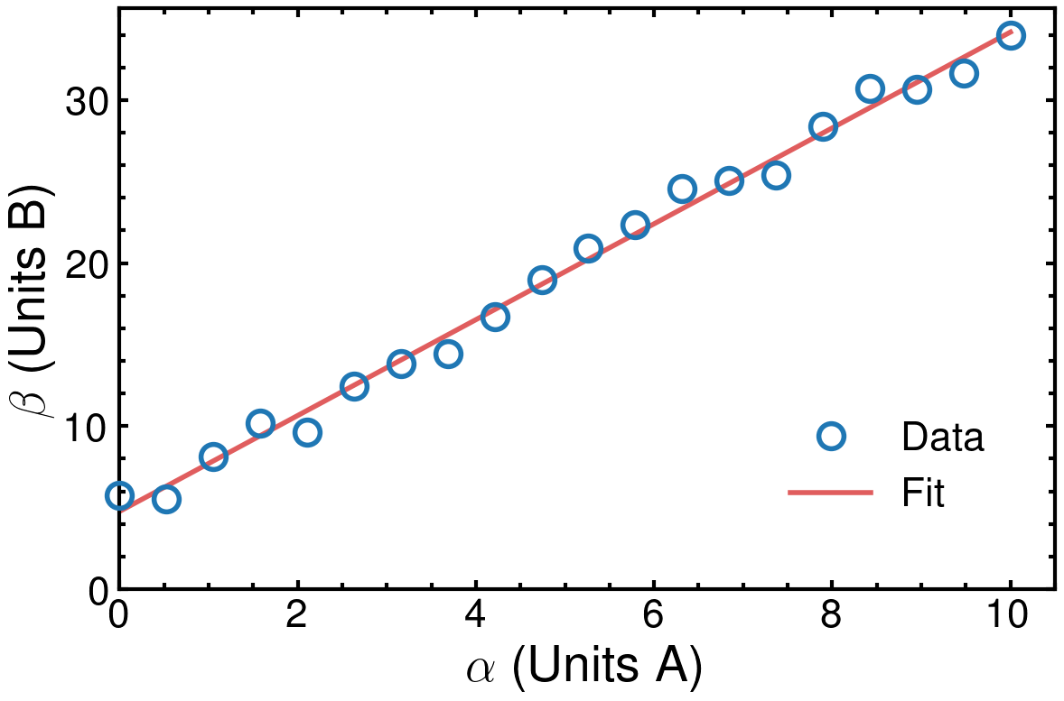
The main purpose of the changes is to improve the readability of the figure, particularly considering how it might appear on an A4 printed sheet of paper (this is always worth trying to keep in mind). This is done by increasing the font size of the axes labels, tick labels and legend items (and can be extended to any other text you might have). Additionally, the axes themselves are thicker, along with the major and minor tick labels.
Furthermore, I have included the nature theme in addition to the default science from SciencePlots, which has the major effect of switching to a sans-serif font throughout. When preparing figures for a specific journal, there may be certain specific style guidelines that should be followed.
Finally, I increased the size of the markers (ms) for the data points, giving them a thick edge (marker edge width: mew) and no centre fill (marker fill colour: mfc). For the fitted line, I increased the line width (lw) and also made the line slightly transparent by adjusting the alpha, with 0 being fully transparent. The result is you can see the line clearly behind the markers. Of course, this may or may not be appropriate depending on your objective.
The final result is what I would argue to be a very professional and publication-ready figure. Nice!
Conclusion
We’ve seen that with fairly little effort, it is possible to take a very basic Matplotlib figure and turn it into a high-quality, publication-ready figure. It should be easy to apply these improvements to more sophisticated figures - those with multiple curves, subplots or even subfigures - something I plan to look at in a forthcoming part 2.
If you are creating a set of figures and you want to have consistent styling, one option is to simply copy-paste your boilerplate code to the top of each script/notebook. However, this quickly becomes tedious and makes it difficult to make consistent, future changes. A possibility is to instead put all of the boilerplate into a separate script located alongside your other scripts, e.g. update_mpl.py :
import matplotlib.pyplot as plt
import scienceplots

plt.style.use(['science', 'nature'])

plot_params = {
    "figure.dpi": "200",
    "axes.labelsize": 20,
    "axes.linewidth": 1.5,
    "axes.titlesize": 20,
    "xtick.labelsize": 16,
    "ytick.labelsize": 16,
    "legend.title_fontsize": 16,
    "legend.fontsize": 16,
    "xtick.major.size": 3.5,
    "xtick.major.width": 1.5,
    "xtick.minor.size": 2.5,
    "xtick.minor.width": 1.5,
    "ytick.major.size": 3.5,
    "ytick.major.width": 1.5,
    "ytick.minor.size": 2.5,
    "ytick.minor.width": 1.5,
}

plt.rcParams.update(plot_params)
Then, at the top of your script, import update_mpl (be careful of relative imports!) along with all your usual packages (numpy, matplotlib etc). If you use Jupyter notebooks, you can also use the magic %run update_mpl.py at the very top of your notebook to run the script (handy for other uses, too). Then, if you make a change to update_mpl.py, just rerun your scripts to generate the updated output.
Version Information
-
python: 3.12.2 -
numpy: 1.26.4 -
matplotlib: 3.8.3 -
scienceplots: 2.1.1
Enjoy Reading This Article?
Here are some more articles you might like to read next: